
Default design review
Requirements: REQ-PRODUCT-MOBILE, REQ-PRODUCT-A11Y, REQ-PRODUCT-DOCUMENTS.
The current pass redesigns the choices experience and examples gallery, and refines the shared typography, document hierarchy, tables, forms, setup controls and interaction states. Functional verification keeps the consent controller, explicit actions, request counter and protected recorded-choice behavior connected to real state. No visual consent or record status is invented.
Actual browser checks, sizes and screenshots are recorded below as they are performed. Broader platform, screen-reader, large-text/keyboard and full surface coverage remain open until inspected.
Inspected in the local browser
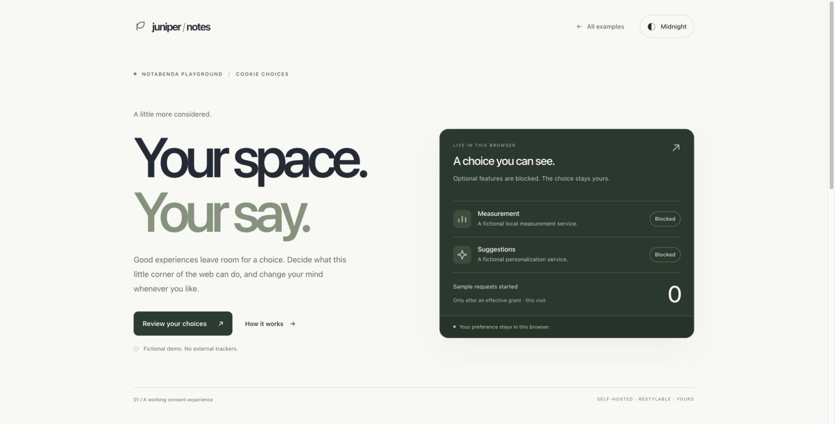
- Light choices: full desktop composition; real Measurement-only grant started one sample request, left Suggestions blocked, and updated the live panel. Withdrawal stopped both services without starting another request.
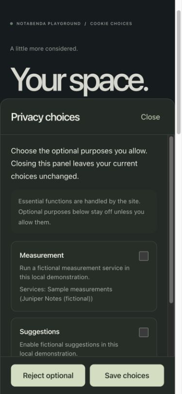
- Midnight choices: 390 × 844 and 320 × 700 viewports. No horizontal page overflow at either width; drawer remained within the viewport at 320px. Both optional decisions remain visible in its footer. Escape closes the drawer and restores focus to “Review your choices”. Output labels identify each service and the request counter.
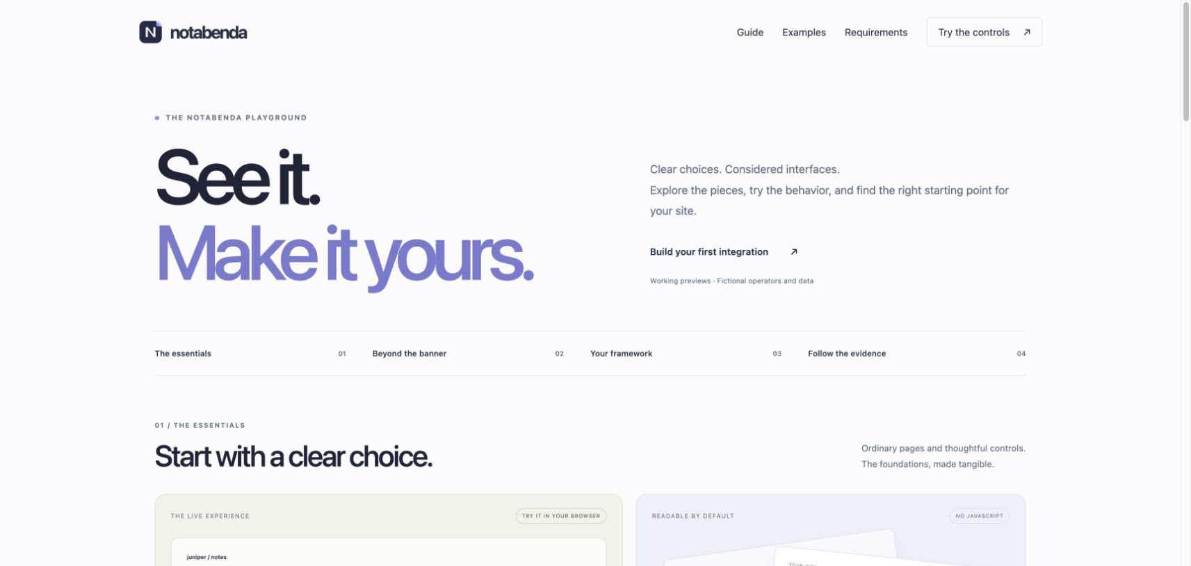
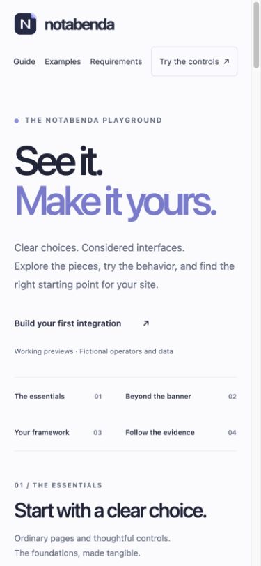
- Examples gallery: desktop, 390 × 844 and 320 × 700. No horizontal overflow on mobile; section navigation reaches the corresponding cards; feature cards recompose to one column.
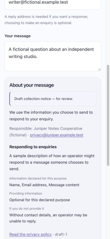
- Collection notice: 390 × 844, no horizontal overflow. Native disclosure opens and closes with Enter and exposes the declared controller, purpose details, recipients, transfers, rights and contact. Notice stays beside the relevant field, with an exact archived privacy revision link. No submission or consent controls are introduced.
- Default privacy page: 390 × 844, inspected heading, metadata, draft notice and contents navigation reading layout.
Independent review found and fixed low-contrast muted light text and admin badges, unlabelled live outputs, and ambiguous navigation out of recorded mode. Recorded pages no longer show a theme toggle; the remaining local-only example link explicitly describes the mode change. Mobile back navigation has a 44px target.
Automated verification
npm run check passed with 196 package tests and 19 site tests, catalog validation, website generation and a Worker deployment dry-run. After the review fixes, rebuilt the website and ran all 20 site tests successfully, including a regression check for contextual output labels and recorded-mode navigation. Actual local Worker runtime checks also passed for auth, retained artifacts, SQLite history/evidence, guided setup and the script-free collection example. No remote deployment was performed.
Screenshots:
Remaining coverage: full cross-browser and operating-system matrix, screen readers, large text/zoom, physical mobile keyboard behavior, forced-color rendering, and exhaustive visual inspection of every admin and framework state. CSS includes reduced-motion and forced-color treatments; their presence is not a substitute for those checks.
All example families
The shared example frame now covers the static overview/brand, React light/midnight, Astro index/notes, collection light/midnight, gated media/frame, privacy signals, storage cleanup, agreements light/midnight, processing opt-outs and retained releases. Choices and discovery retain their composed page designs. Legal artifacts stay outside the entry-page transformation. Framework SSR-tree equality and every emitted pinned-document HTML digest are now checked explicitly.
Actual browser checks in this pass:
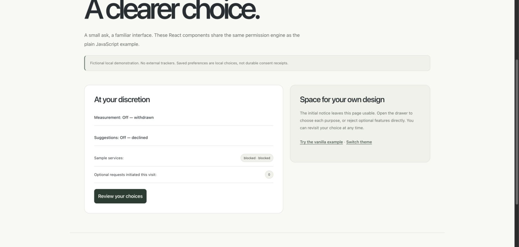
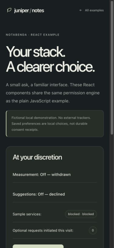
- React desktop and midnight 390px: composed live/context panels, no hydration errors, no horizontal overflow on mobile.
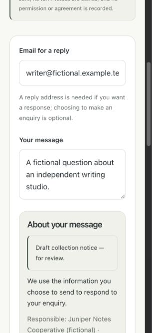
- Collection desktop and 320px: form/context panels, readable inline notice, full-width narrow form with no page overflow.
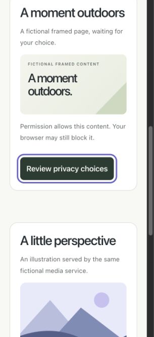
- Gated media desktop: two designed placeholder panels; initially no live iframe/image or media request. Allowing creates both resources and two observed requests; withdrawal removes both with no new request. The framed page was adjusted to fit its actual embedded viewport.
- Privacy signals desktop: actual cookie grant remained allowed while the labeled GPC simulation blocked advertising and left sample tools active.
- Retained releases desktop: current/previous release cards and a separate comparison/references panel.
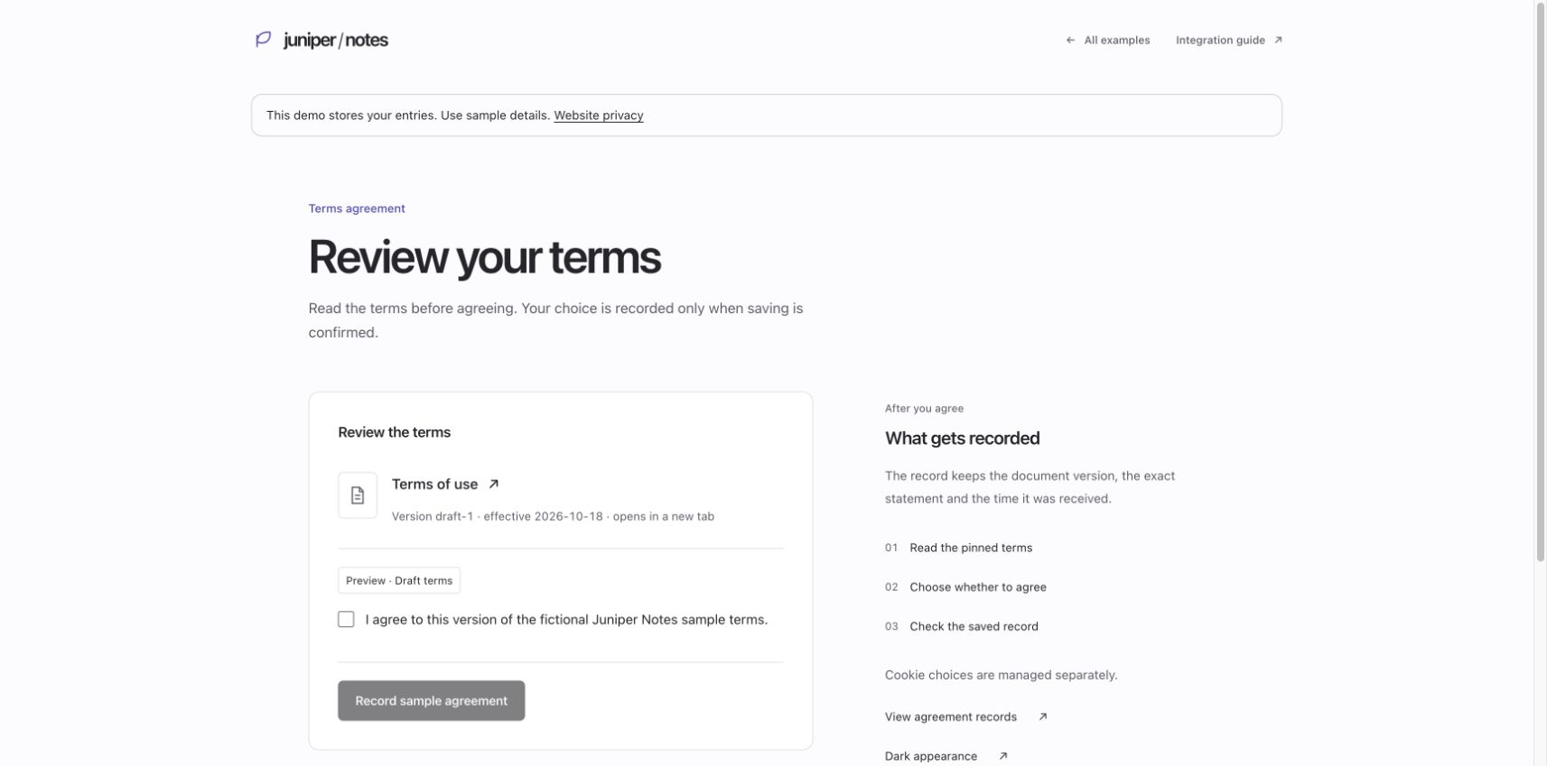
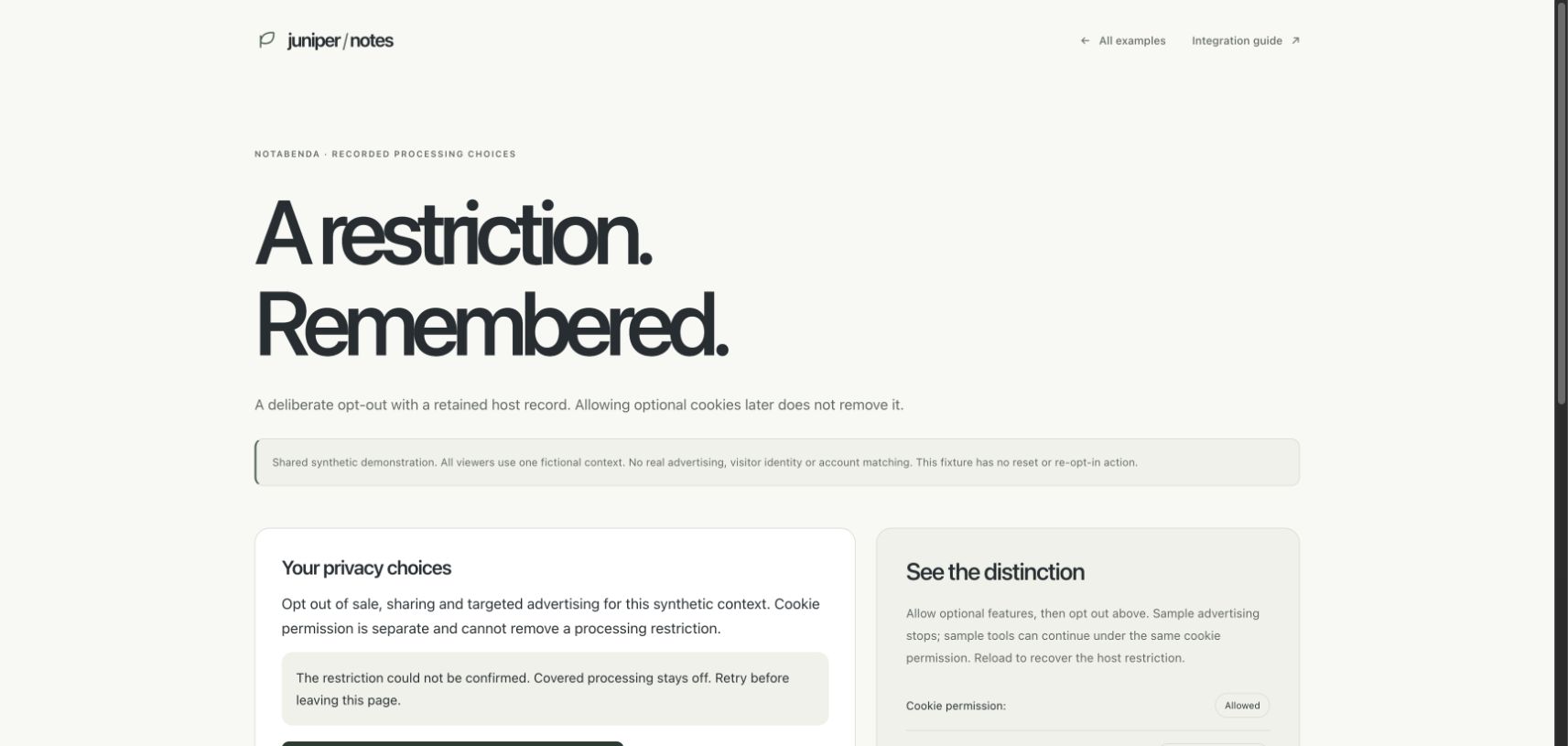
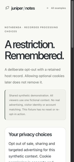
- Agreement and processing examples: inspected using the loopback synthetic host. The processing example also displayed its truthful unconfirmed-history error with restricted advertising still blocked; no successful recording was inferred from that state.
- Astro at 320px: navigation retained the Measurement grant, one controls mount and one initiated request. After its transition settled, scroll/client widths matched.
- At 320px, embeds, privacy signals, releases, midnight collection, agreement and processing examples each had equal document scroll/client widths. Storage cleanup also matched at 320px. These are layout checks, not a full device/accessibility certification.
Screenshots: React desktop, React midnight mobile, collection mobile, Astro mobile, media, signals, releases, agreement, processing desktop, processing mobile.
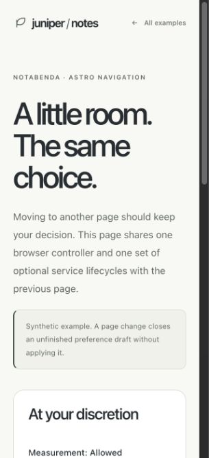
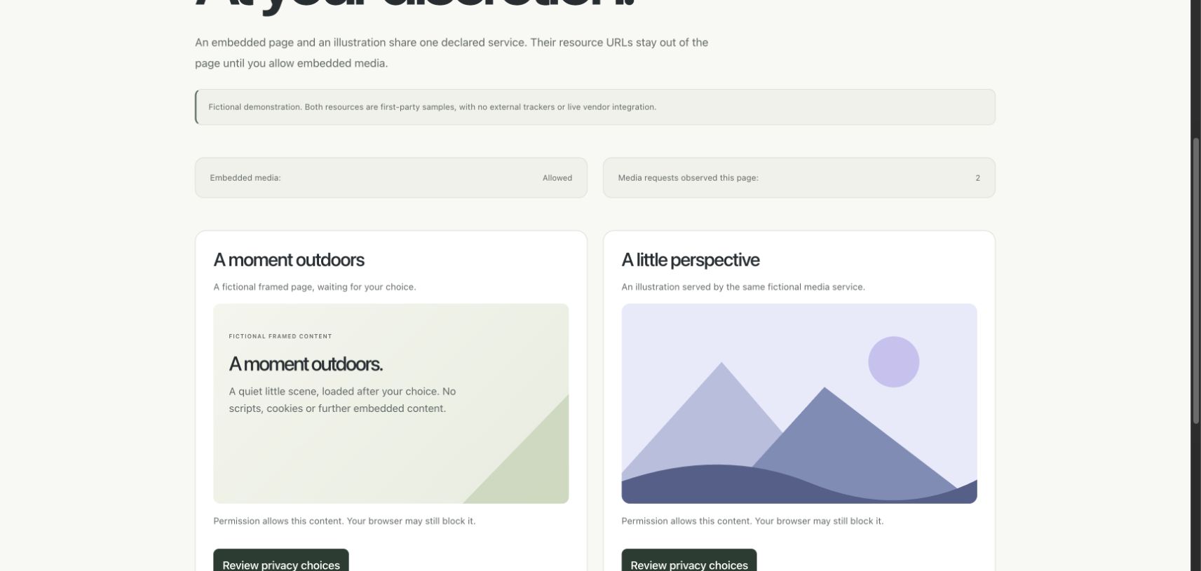
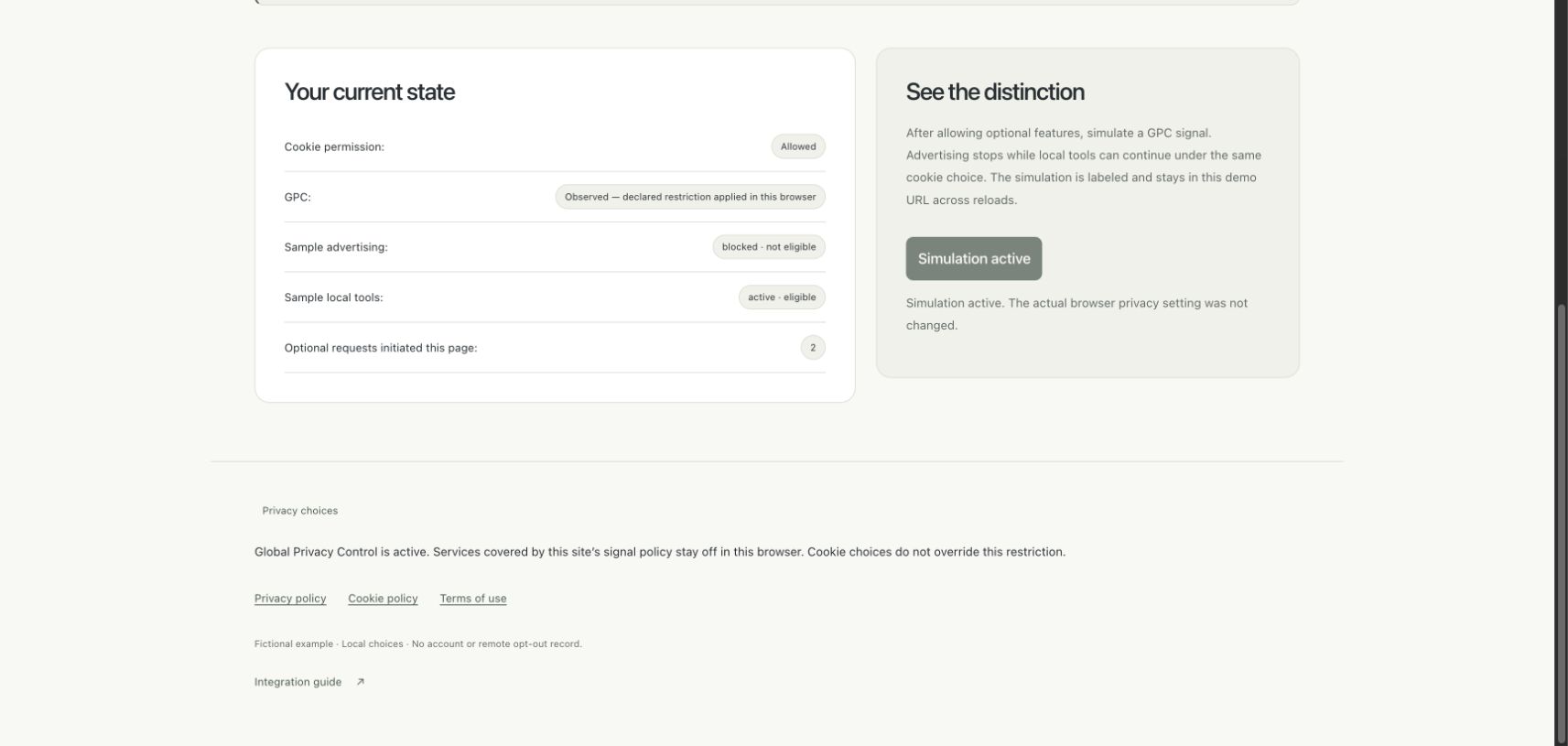
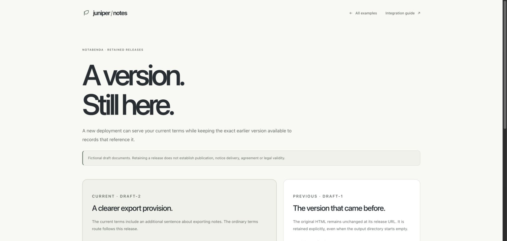
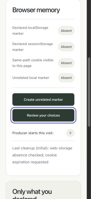
Final checks for this pass: npm run check passed all 216 package tests and 24 site tests, catalog validation, website generation and the Worker deployment dry-run. Independent review caught an internal storage-button overlap that document-overflow checks alone missed. The action row now uses wrapping flex layout; at 320px the two 44px-high controls stack without overlap. The framed media title now has viewport-specific sizing that wins over the shared mobile headline rule; the actual desktop frame displays its full title and copy without a vertical scrollbar. The narrow frame keeps its title and omits only decorative copy. Storage mobile screenshot.
The native Astro layout was also rechecked at 320px: index-to-notes navigation retained one initiated request and the existing grant, and its external navigation returned to the examples gallery without console errors. Discovery's light review and midnight mobile review use the same design standard; its 390px and 320px document widths did not overflow. The actual narrow media frame shows its complete title without a scrollbar. Final local Worker integration checks passed for retained release bytes, private source comparisons, consent/opt-out evidence, exports, discovery, setup and script-free legal routes.
Admin workspace and setup redesign
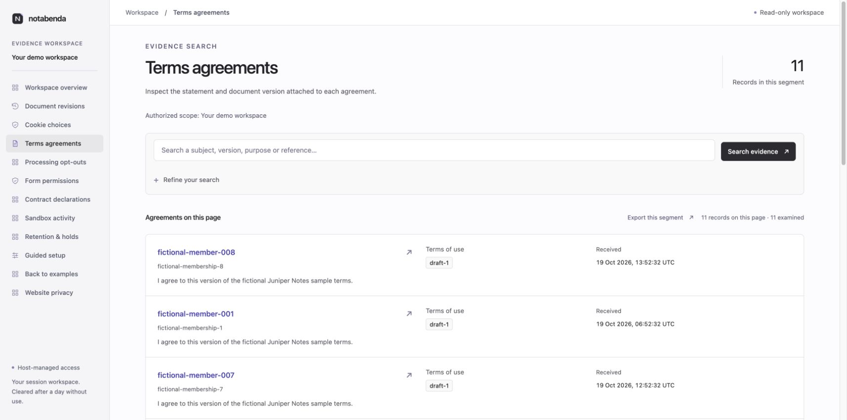
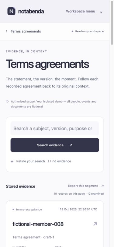
The admin now has one shared application frame: navigation rail, current-section header, clear page hierarchy and restrained ink/lavender surfaces. Record search uses a primary field and native expandable advanced filters. Populated advanced filters remain visible. Agreement cards lead with the stored subject reference; counts describe only the returned segment. Document/source comparisons, event detail, lifecycle and export views inherit the same frame. The demo overview no longer introduces a second header/navigation system.
Guided setup uses that frame with six navigable stages, individually expandable practices, visible assessments and a separate review/export step. Stage changes preserve private notes. Previous/continue moves keyboard focus to the next section. Recommendations still come from the same versioned engine; editing invalidates old downloads. Host navigation is detached and escaped, and links neither change a store scope nor authorize a destination.
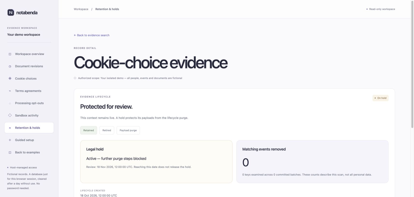
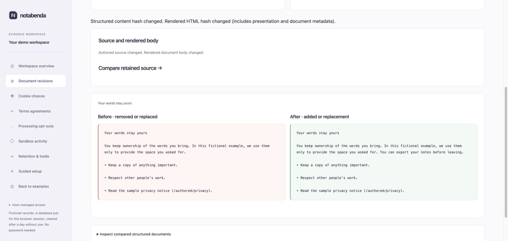
Actual Chromium checks on 18 October 2026: desktop agreements, subject search returning one expected record, agreement detail, document history and a terms comparison, held evidence, demo overview and setup. In setup, a fictional yes assessment and private justification survived navigation and produced a current review with two download links. The mobile menu and history were inspected at 390px and 320px; setup and expandable practices had no horizontal document overflow at either width. Setup stage controls measured 44px high. Mobile text inputs use at least 16px text. These are local browser checks; the remaining platform/accessibility matrix above still applies.
npm run check passed 271 package tests and 37 site tests, catalog validation, website generation and the Worker dry run. The real local Worker runtime checks passed for host authorization, SQLite archives/ledgers, setup, lifecycle, demo isolation and static routes. Nothing was committed or deployed.
Screenshots: agreements, mobile agreements, guided setup, mobile setup, held evidence, terms comparison.
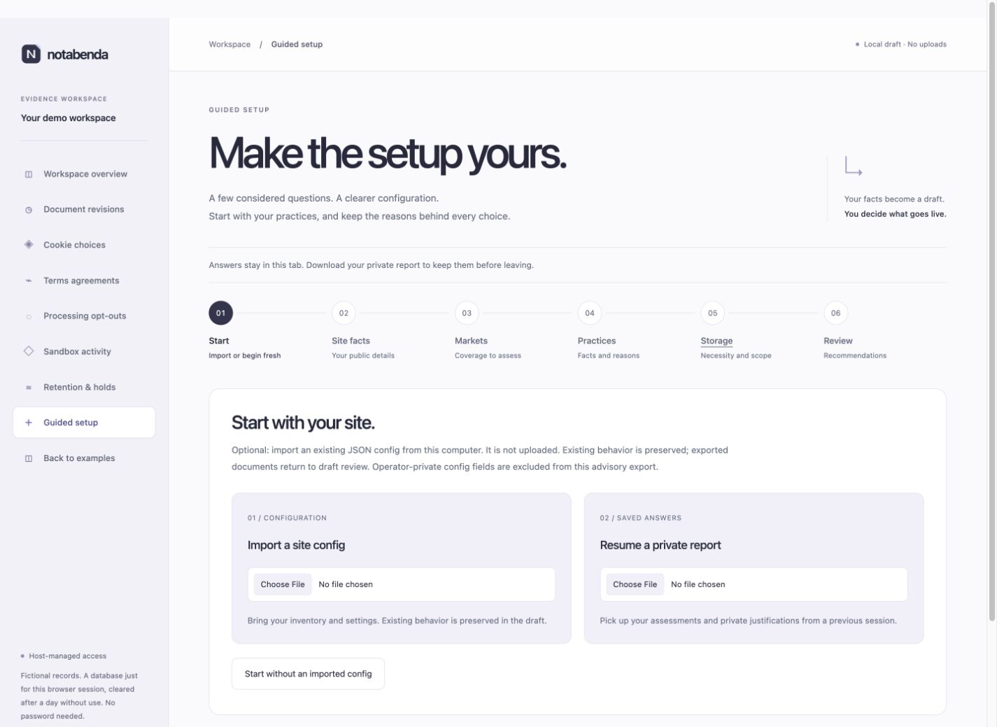
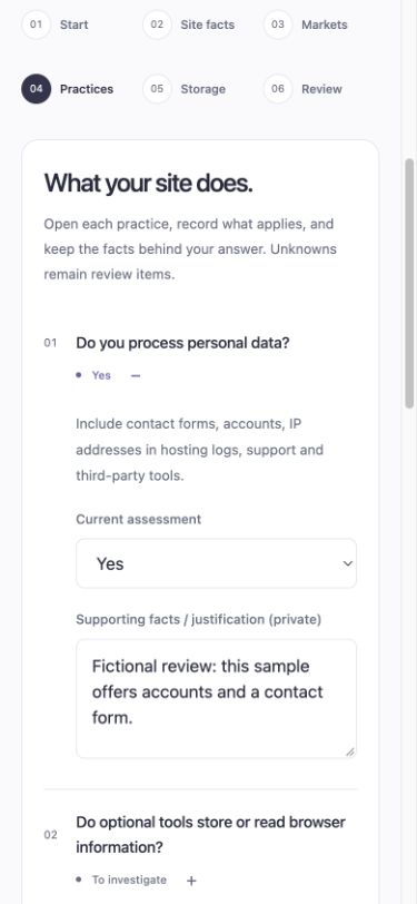
Setup received a further composition pass: connected numbered guide, clear section headings, paired import panels, responsive assessment rows and a recommendation grid with folded review items. Stage changes bring the active work into view and generated reviews receive keyboard focus. All six stages fit at both 320px and 390px viewport overrides. See setup verification for actual observations and the updated screenshots.
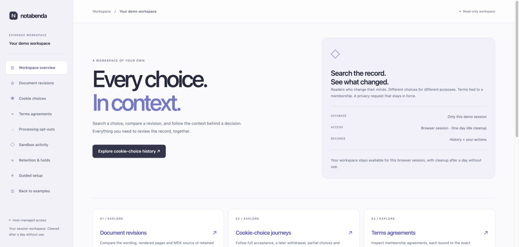
The public copy now keeps demo status secondary: repeated fictional/synthetic-data promotion has been removed from the main site, gallery, workspace overview/rail and example notices/footers. Workflow descriptions, real operational limitations and draft document status remain in context. The admin overview was inspected in Chromium; updated overview. The full check passed 294 package tests and 37 site tests after these presentation changes.
The maintained form-permission example now follows the shared light/midnight composition and connects to its session's permission history. The field remains visible when initial state loading fails or stalls. Actual Chromium checks covered independent draft submission, grant, withdrawal, cross-theme reload and historical-grant/current-withdrawn inspection. Public fields at 320px and 390px and admin search at 320px fit without horizontal overflow. Public input text is 16px; permission buttons are 46px high. See form-permission verification for screenshots and remaining platform work. Redundant fictional-data copy was also removed from the choices hero, media descriptions, contact form labels and React status messages.
The visitor/operator UX review now supplements visual checks with task completion, explicit pending/confirmed states, keyboard continuity, unsupported choices, actionable setup diagnostics and same-contact permission history. Earlier demo document releases remain explicitly retained when purpose wording changes.
Current shared visual refresh
The public website, optional package styles, service directory, example frame, evidence/admin shell and setup now share neutral surfaces, restrained violet accents, smaller consistent corners and clearer type hierarchy. Operator headings no longer use marketing scale; evidence uses contextual rows, line icons replace inconsistent glyphs, and setup uses a compact six-section navigator. The homepage now shows the actual workspace; the README uses the current notice. Linear’s March 2026 design notes inform hierarchy and restraint, without copied assets.
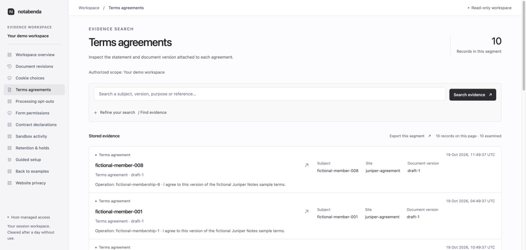
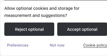
Actual Chrome checks covered desktop evidence/setup, the homepage and gallery; mobile setup/practices; React/Astro, form permissions, contract withdrawal, Google Basic, dark choices/discovery/services and a privacy document. Inspected 390px layouts had no horizontal document overflow. Setup/practices and dark choices also fitted at 320px. Setup section targets were 48px tall; mobile accept/reject targets were equally sized at about 160×45px, with separate 44px preferences/dismissal actions. The deliberately opened sheet retained its bounded height. Native stage changes and source/condition disclosures remained usable.
These are specific inspected states, not a claim of complete accessibility or pixel verification. Cross-browser, screen-reader, zoom/large-text and further forced-color review remain open. Runtime admission, actual permission, immutable document content and source archives continue to require their existing tests.
The final check passed 511 package tests and 62 site tests, catalog validation, site generation and the Worker deployment dry run. Review added a regression for custom evidence kinds named constructor, __proto__ and toString; their labels remain safe text. Selected workspace/setup navigation retains an explicit system-color border after the refresh overrides in forced-colors mode. Metadata labels were darkened for ordinary text contrast. Native forced-colors device verification remains open.